Starter quiz
- Once humans reach the ______ stage of development, they do not grow any taller.
- 'adult' ✓
 What number is marked on this number line?
- 6
- 6.5 ✓
- 7
- 7.5
-
 Which of these units can be used to measure human height?
- centimetres ✓
- kilometres
- grams
- kilograms
-
- Why might scientists use a line graph to show their results?
- To practise their maths and science skills.
- To make their data look prettier.
- To make their data easier to understand and analyse. ✓
- To make their data more confusing.
-
- Scientists can calculate a ______ to help them find patterns in results. They do this by adding together the amounts they have and then dividing by the number of quantities they added.
- 'mean average' ✓
- Match the decimal number to the correct fraction.
- 0.25⇔¼ or one quarter ✓
- 0.5⇔½ or one half ✓
- 0.75⇔¾ or three quarters ✓
- 1⇔1 whole ✓
Exit quiz
- Which of these diagram is a bar chart?
 A ✓
A ✓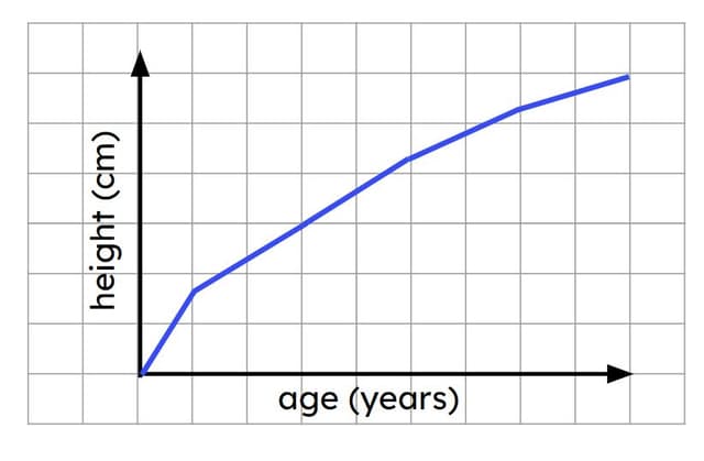 B
B C
C
- A ______ graph is useful for showing human height at different ages because it shows how a value varies between different points.
- 'line' ✓
- Which of these graphs could show changes in human height between the ages of 25 and 40?
 A
A B ✓
B ✓ C
C
- When scientists use their results to predict what they think will happen in future investigations, it is called making a...
- 'prediction' ✓
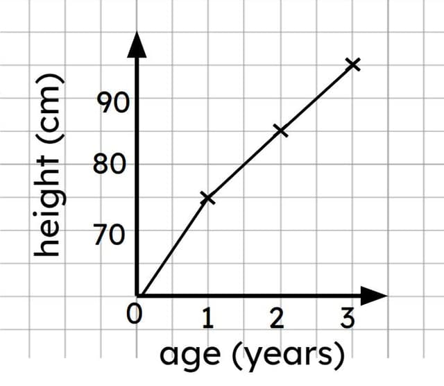 According to this graph, how tall is a 1½-year-old likely to be?
- around 75 cm
- around 80 cm ✓
- around 85 cm
- around 90 cm
-
- Andeep’s sister is 67 cm tall. Use the graph to predict how old she is likely to be.
- around 3 months old
- around 6 months old ✓
- around 9 months old
- around 1 year old
- around 2 years old
-
Worksheet
Presentation
Video
Lesson Details
Key learning points
- Scientists can use graphs to represent data visually and make it easier to understand.
- Human height can be measured and plotted on a line graph to show how height varies with age.
- Findings from enquiries can be used to make further predictions.
Common misconception
Pupils may not recognise the value of representing data on graphs or charts and might view it as just another task to complete.
Using the lesson resources, clearly explain the value of presenting data in a chart or graph and how it makes information easier to understand.
Keywords
Data - In science, data is information collected during an investigation, which can include numbers, symbols, pictures, or text.
Analyse - To analyse data is to examine it carefully in order to explain or interpret patterns, trends, or relationships.
Bar chart - A bar chart is a type of diagram that visually represents data using rectangular bars.
Line graph - A line graph is a type of diagram that can be used to show how a variable changes over time.
Prediction - A prediction is a statement about what is expected to happen.